Facebook, the social media giant with over 2.1 billion users, was started in a dorm room. The history of this company has been covered extensively and is still one of the most interesting founding stories out there. The company has seen an illustrious career with minor backlashes here and there till date and its logo is one of the most recognisable one’s today.
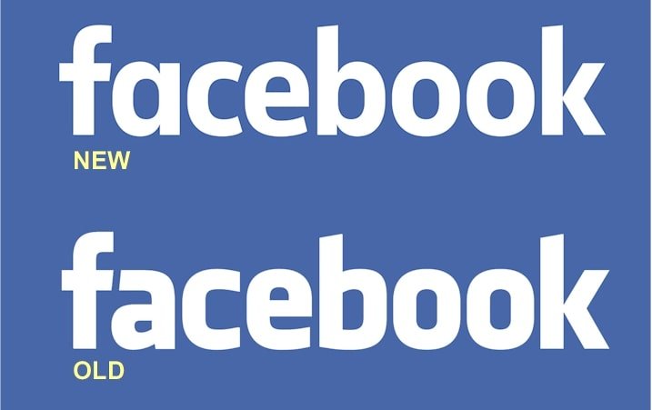
Here is a quick throwback of the evolution of Facebook’s logo.
As soon as Facebook’s popularity began to grow, Mark Zuckerberg along with Sean Parker hired Cuban Council’s Mike Buzzard to design a logo for them.
The first logo ever designed was very close to the one that was in use for a long time. The company only made minor changes to it in the later years.“It was a modification of the typeface Klavika, which was designed by Eric Olson. Type and graphic designer, Joe Kral, who was a good friend that was working closely with the Cuban Council at the time, completed the type modifications and final wordmark, whilst I oversaw the project”, Buzzard said in an interview.
Story behind the colour of the logo.
The colour scheme of the logo has a rather interesting story. Mark Zuckerberg suffers from deuteranopia, a form of color blindness that makes distinguishing colour difficult for some people. On the positive side, a person with the condition is able to distinguish blue very well and hence blue was chosen as the colour for the logo.

The logo featured a very simple design that was straightforward. The lowercase in the letter F was used to showcase that they were a casual company.

Facebook’ New logo and what it means for the company.
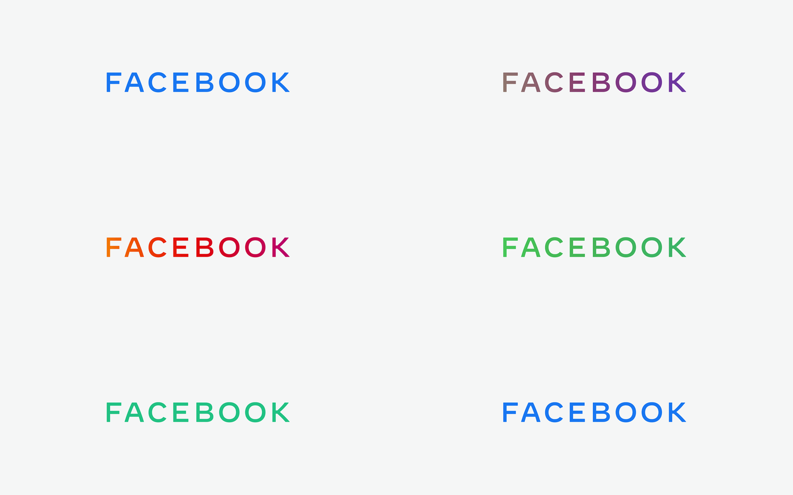
Early this November, Facebook’s new logo was unveiled to represent the parent company and was the talk of the town. The parent company owns Facebook, Instagram, WhatsApp, Oculus and more. The font is plain and the gif version of it displays various colours representing all the companies under the parent name.

The logo is supposed to be rolled out for use in the coming weeks and we will soon be seeing it on all Facebook products.
Over the last 15 years, Facebook has grown tremendously and with its acquisition of new companies, it strongly wanted to distinguish itself from the social media platform label.
Facebook’s new logo exudes clarity and is a custom typography. It was made to create a very strong visual distinction from the parent company and its other products. The new logo is giving people the reassurance of the goodwill it holds with its other brands like WhatsApp and Instagram.
What are your thoughts about Facebook’s new logo? What are some of the logos you love and why? Let us know in the comments below.
If you are someone who needs help with branding and online advertising, we are the right people to talk to! Just click on the blue button below, submit your digital marketing query and one of our marketing experts will get in touch with you!


