As a digital marketer, you might have heard that a great landing page is essential to any PPC strategy. So then you need to ensure that the landing page meets client expectations, their demands and works as hard as it can to transform those clicks into conversions. The main point here is the ability to deliver relevance to searchers that has an impact on Google’s Quality Score which in turn affects the AdRank and bidding costs and ad positions.
Google doesn’t tell you exactly how AdRank and Quality Score work in the process but the general principle lies in delivering a quality ad that should optimize the performance of the landing page while satisfying Google’s objectives.
The majority of landing page visitors are very unlikely to convert so we should have secondary objectives such as explaining the company’s products or services or generally creating awareness that needs to be taken into account.
1. Which Type of Landing Page Should You Use?
Do you know that an integrated landing page is more efficient because the pages are developed as part of the website’s design? One disadvantage is that they are not much focused on the conversion goal and undergo struggles meeting the objectives than bespoke landing pages. But pages integrated into a site can be found more appropriate for general queries too. Users searching for “TVs” or “digital cameras” may find a specific category page more useful than a focused landing page. A fine solution would be a hybrid of the two methods – an optimized version of such existing pages or utilizing the homepage as the landing page and adapting its messaging.
2. Make Landing Pages Relevant to the PPC Ad
Users clicking on PPC ads are likely to have a strong purchase intent compared to casual browsers. Hence, the landing page needs to fulfill its expectations. If a consumer clicks on an ad for iPhone 12, they should also see text and images that match the query, details of prices, and how to actually buy one. Here they will make a quick decision either to stay or leave the page, and the ad relevance to the PPC will reduce the expected bounce rates sending the right signals to Google.
3. Use Graphics and Imagery Wisely
Graphics and images are the 2 design factors that can have a big impact on conversions, so you need to choose wisely. This is an area to be tested since different imagery makes different impacts. So make sure the ads you run have a relevant factor in them – for example, if you’re running an Ad in Singapore make sure to use a face that connects to its audience.
4. Consider Removing Navigation Options
Removing the navigation options helps eliminate distractions for the audience and increases the chances of completing a purchase or filling out a form. But this also leaves users who don’t take these actions in a confused state. The perfect solution would be reducing the number of navigation options which thereby removes most of the potential distractions, while still leaving paths to the rest of the site.
5. Continuity from PPC Ads to Landing Page
This is a simple strategy but a lot of sites do it wrong. When you click on the ad, the language and imagery on the landing page should comply with the ad. One simple and easy way to achieve this is to use the same language on both.
6. What to Do with Old Landing Pages
For short-term campaigns, landing pages are often created. So next we need to think about what happens to the page after the campaign has finished. Utilizing a custom 404 error page or a 301 permanent redirect is one way to manage this issue since it avoids having customers viewing out-of-date offers.
7. Options for People Who Don’t Buy or Sign Up
Not everyone will buy or sign-up for already created landing pages, so you need to provide options for those who don’t. For the ones having questions about the product or service adding prominent phone numbers or live-chat options will work well. For other users, offering sign-up options for updates like offers, etc, or providing a destination link to other areas of the site can keep people interested.
8. Show Some Social Proof
Social proof here refers to reviews, recommendations, feedbacks and testimonials that will work well online. So use it on landing pages. Even renowned trust marks and security logos can be useful. This reinforces the credibility of the brand and website.
9. Experiment With Page Length
When it comes to page length, there is no right or wrong answer here. Basically, Neil Patel says, ‘It depends’. The length should not be really long to sell the information about the product but should be short, crisp, and to the point to attract the audience. Maybe a more detailed page works with more complex products and services.
10. Clear Call to Action
What comprises a good call to action is debatable but the purpose should always be clear and there are many different ways to achieve the accurate goal. What do you need to consider?
- Easy to find it – If users are having trouble searching for the call to action, it isn’t doing its job.
- Color – Remember to make the color of the CTA stand out from most of the content.
- Position on the page – Place the CTA where people can see it, or place multiple CTAs for people to see them on long landing pages.
- Size – It should be big enough to stand out.
- Wording – The wording should for sure communicate the action you want users to take.
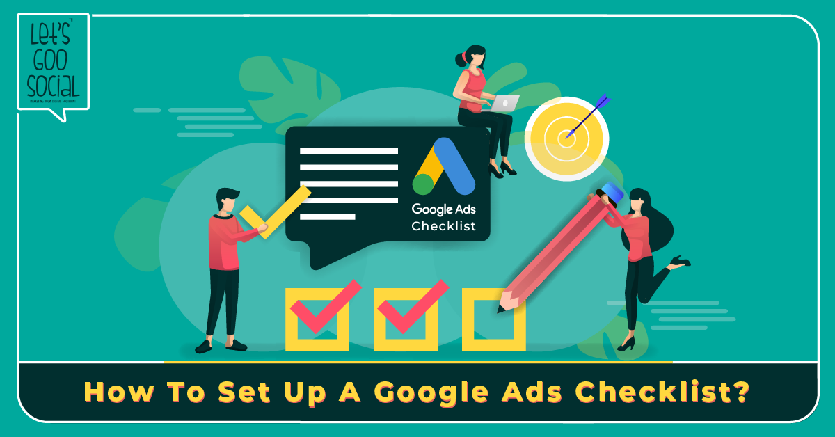
Primarily in PPC landing pages, all these mentioned tips are applicable but many of these principles work equally well to other kinds of landing pages. If you want your checklist to be ticked right enabling your Ads to gain maximum ROI, then choose Let’s Goo Social. An independent 360-degree digital marketing agency in Chennai taking care of all ads and campaigns thoroughly to give you successful growth. Our team of Google Ads experts delivers cost-effective strategies that can make your brand #1 in its field. For all your queries, you can Call our experts at IN: +91 9087706000 | SG: +65 8008526877 today and we will be delighted to help you.


